

Choosing colors for your business? The task can seem daunting if you are unaware of what you want. Even during our base consultations with clients, we emphasize the importance of color choice in there marketing.
Not sure where to start? Here’s our basic rule of thumb.
Use a 3-color palette
Use at least three colors: base, accent, neutral colors. You can choose to do more than 3 but at least 3 creates the best scope of colors to showcase your brand.
From all the traits of your business which is the most important. Colors associated most with that trait should be your base color.
We typically choose your second highest trait as a business as the accent color. This can by slightly tricky because it still needs to pair visually with your base color.
Your neutral color is what we use for your background color.
Choose a color scheme
We work within these four schemes the most and are the most commonly used in the market.
- Monochromatic — When you have one personality trait that you want to focus in on, a monochrome scheme will emphasis the meaning of that one brand color. While great for minimalist brands, the challenge here is differentiating the hues enough that your sight doesn’t become visually stunted.
- Analogous — Colors next to each other on the color wheel have harmonious relations, since adjacent colors usually have similar emotional connotations. Analogous schemes are safe bets, but as such not the best for standing out or drawing attention.
- Complementary — Color complements — or opposites — are colors directly across from one another on the color wheels. Because they’re opposites, they bring out the best in each other when paired; you see complementary colors a lot in sports teams. Complementary colors are great for dynamic, stimulating visuals, but be careful of copycatting another brand since they’re so popular.
- Triadic — A stable branding color scheme, triadic colors draw in equal parts for three different sections of the color wheel. Triadic schemes are stable like analogous themes, but offer a more stimulating variety like complementary schemes. The hardest part is getting the three colors to coincide with the traits of your brand identity.

Our take on finding your fonts
Fonts are whole other atmosphere of ‘whoa’. Fonts have there own persona and paring it with your new color scheme will either diminish or amplify what you’re building. Let’s breakdown the two types of fonts that we typically work with.
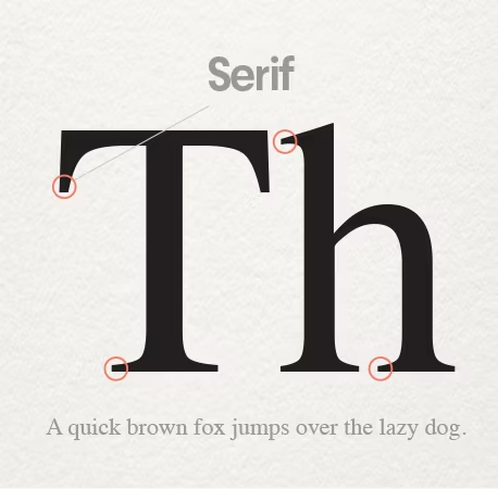
Serif fonts
Serif fonts are lettering that includes curls or hooks at the end of the character. For example in the font ‘Times New Roman’ their are little handles for the T and L and W. Characters that have theme embellishments are considered serif fonts.
From our experience we use serif fonts to convey feeling of flair, attitude or age.
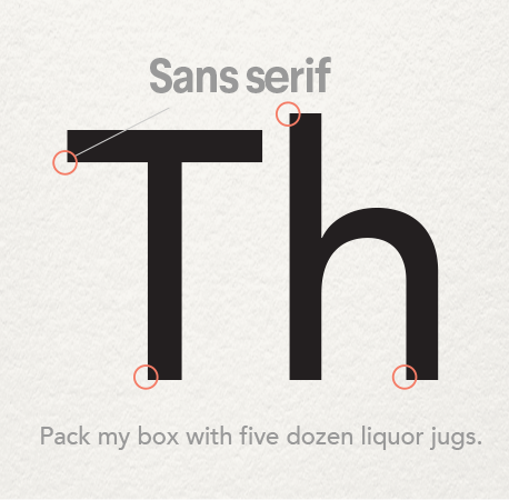
Sans serif fonts
Sans in French means ‘without’ so sans serif fonts have characters without any extra embellishments at the end of characters. Fonts like ‘Century Gothic’ have round curved features that are also open in typeface.
From our experience we’ve used sans serif fonts to convey a more modern or youthful feel.
Rules are: their are no rules
Even with the following guides there’s room for detouring from this method and still having an amazing color palette that best showcases your business. Keep in mind that a color scheme is only one tool that increases awareness of your brand alongside, your brand voice and key branding elements.